|
|
Post by kyben on Sept 12, 2006 17:42:24 GMT -5
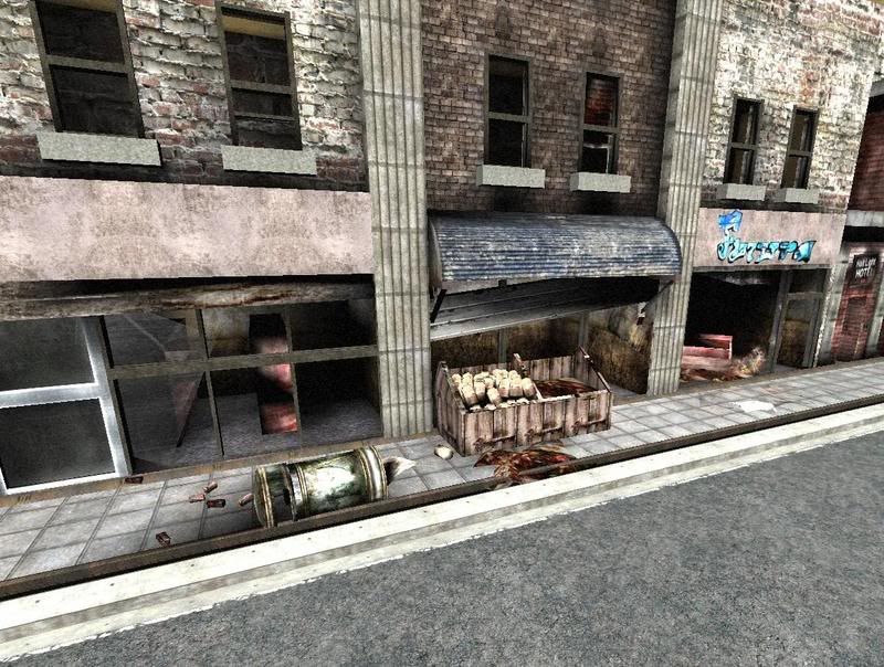
I did this in an hour. Couldve been better with the right lighting, but I just made it bright so you can see it.  Couldn't get the body in there or the signs. I did this just to see how well I can follow a picture, cuz I've never tried it before. |
|
|
|
Post by el'PiX on Sept 12, 2006 18:05:54 GMT -5
I'm impressed. Are you impressed? I'm impressed.
And so fast?
|
|
Hayato
Stalker
 Exhausted Soldier
Posts: 199
|
Post by Hayato on Sept 12, 2006 18:13:45 GMT -5
You're impressed? Of course I'm impressed.
I think we have a bonafied mapper on our team.
|
|
|
|
Post by Abyx on Sept 12, 2006 19:04:46 GMT -5
The sizing looks a little funky, but I like it. Great work as always, Kyben.  |
|
|
|
Post by zombieButcher on Sept 13, 2006 5:35:48 GMT -5
Kyben <3 me :$
|
|
|
|
Post by uwasawaya on Sept 13, 2006 14:26:32 GMT -5
Kyben, you rock my socks! i'm damn impressed.
|
|
|
|
Post by Doyora on Sept 13, 2006 15:00:42 GMT -5
TBH, I'd envisioned it as a mix of smesh + BSP, since BSP has better lighting. Kyben's done pretty much what I would have except for a few minor differences (like making the windowsills smeshes). It looks quite nice considering the resources, but it would look much better with new textures and smeshes. I expect this is what will be done, so no worries.
I don't understand what you mean with the sizing, Abyx. Aside from the fruit stall being a tad too big, it's perfectly proportioned.
|
|
|
|
Post by Abyx on Sept 13, 2006 15:19:11 GMT -5
I don't know, it might just be me, but everything just looks weird.. *shrug*
|
|
|
|
Post by Doyora on Sept 13, 2006 15:24:14 GMT -5
Well, if you're going to be really picky, the fruit satll is too big, the pavement is too narrow, the bookshop door is too wide, there are no visible roaed markings making it look to wide, some textures are misaligned and it's England. Our buildings are shaped different to those in USA. Personaly, I think it looks quite nice for something I designed and someone else built.
|
|
|
|
Post by zombieButcher on Sept 13, 2006 15:35:29 GMT -5
I don't know, it might just be me, but everything just looks weird.. *shrug* Thy shall not criticize any of ze Kyben's work. |
|
|
|
Post by Doyora on Sept 13, 2006 15:39:00 GMT -5
Fanboy.  |
|
|
|
Post by Abyx on Sept 13, 2006 15:43:32 GMT -5
Well, if you're going to be really picky, the fruit satll is too big, the pavement is too narrow, the bookshop door is too wide, there are no visible roaed markings making it look to wide, some textures are misaligned and it's England. Our buildings are shaped different to those in USA. Personaly, I think it looks quite nice for something I designed and someone else built. That works.  |
|
|
|
Post by kyben on Sept 13, 2006 15:48:54 GMT -5
Yeah, my list is longer of what problems there are. I didn't put the love that I usually put into a map, just a quick build and get it close to what the picture looks like. I did make them like USA buildings cuz I don't really know much about Englands buildings. I didn't think to look it up on google. Sizing was the hardest thing to get from just going off a picture. I did simple sizes like the window is 100 tall and 50 wide, so thats probably why the sizing is funky. Criticizing's good, without it you wouldn't get any better.  |
|
|
|
Post by zombieButcher on Sept 13, 2006 15:56:43 GMT -5
Fanboy.  Lol, that made me feel like such a whore. |
|
|
|
Post by Doyora on Sept 13, 2006 15:58:57 GMT -5
Englands' buildings are easy. just think taller, compacter (that's a word.. maybe) and kinda twee. and usualy a bit grubby. None of the concrete facades and prefab stuff you get.
|
|